
Executive summary
A good SME dashboard should do more than display charts. It should help leaders understand business performance, spot risks early and focus on the numbers that actually support better decisions.
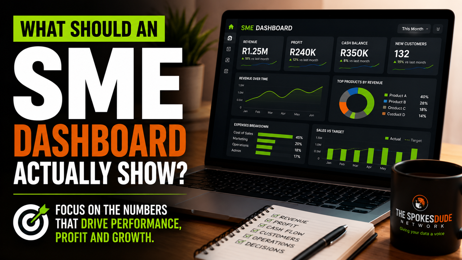
Dashboards are everywhere. Businesses use them to track sales, customers, expenses, operations, marketing, staff performance and almost anything else that can be measured. And yet, many business dashboards are surprisingly difficult to use. They may contain dozens of charts, colourful indicators, filters, gauges and tables, but still leave the person looking at them with one important question: So what am I supposed to do with this information? For a small or growing business, a dashboard should not exist simply because dashboards look professional. It should help the owner or management team understand the health of the business quickly enough to make better decisions. That means the most important question is not, “How many charts can we fit on the screen?” It is: “What does management need to know in order to run this business well?”
A Dashboard Should Start With Business Questions
One of the biggest mistakes organisations make is starting with the data instead of the decision. Someone opens a spreadsheet, sees twenty columns and begins building charts for all of them. Sales by month. Sales by product. Customers by province. Orders by employee. Revenue by category. A pie chart here. A bar chart there. Perhaps a gauge to make the page look more sophisticated. Before long, the dashboard contains plenty of information but very little direction. A better approach starts with the questions the business needs answered. A business owner may need to know whether revenue is growing, whether the company is profitable, whether customers are returning, whether expenses are increasing faster than income and whether the organisation has enough cash to meet upcoming commitments. Those questions should shape the dashboard. The data comes afterwards.
The First Thing a Dashboard Should Show Is the State of the Business
An SME dashboard should give the owner a quick sense of whether the business is healthy. That does not require twenty key performance indicators. It requires the few measures that genuinely represent the condition of that particular business. For many companies, revenue will be important. But revenue on its own can be misleading. A business can increase sales while becoming less profitable. It can acquire more customers while spending too much to acquire them. It can report a healthy profit while struggling to pay bills because customers have not yet paid their invoices. A useful dashboard therefore needs to present business performance in context. The purpose is not simply to tell management that sales were R500,000. The dashboard should help management understand whether R500,000 is good, bad or unexpected. How does it compare with last month? How does it compare with the same period last year? Was there a target? Are costs rising at the same time? Is the business actually retaining enough of that revenue? A number becomes useful when it is connected to a business question.
Revenue Matters, but So Does the Trend
Most SMEs naturally want to track sales or revenue. That makes sense. The mistake is showing only the total. Imagine a dashboard with a large card displaying: Revenue: R1.2 million That number appears impressive, but it tells us surprisingly little on its own. Perhaps the business made R1.4 million during the previous period. Perhaps its target was R1.8 million. Perhaps one customer generated 60% of the revenue. Perhaps revenue increased while profit margins collapsed. The useful question is therefore not only how much revenue the business generated. Management should also be able to see the direction in which revenue is moving. A simple trend over time can often be more valuable than several decorative visualisations. It allows the business to see growth, decline, seasonality and unusual changes. That is where management begins to move from reporting towards understanding.
Profitability Should Not Disappear Behind Sales
Growing revenue feels good. It is visible. It is easy to celebrate. It is often the number businesses talk about first. But businesses survive on more than revenue. They need margins. A company can sell more and still make less money. Discounting may increase sales while reducing profit. Supplier costs may rise. Delivery costs may increase. A product that generates significant revenue may have such a small margin that another lower-volume product is actually more valuable to the business. A useful SME dashboard should therefore help management understand the relationship between income and cost. Exactly which profitability measures matter will depend on the business. For some companies, gross margin may be critical. For others, contribution margin or operating profit may be more useful. The principle is the same. Do not allow sales growth to hide deteriorating economics.
Cash Deserves Its Own Attention
Profit and cash are not the same thing. That distinction becomes extremely important in growing businesses. A company may record a sale today but receive payment sixty days later. Meanwhile, salaries, rent, suppliers, subscriptions and other expenses still need to be paid. This means a company can appear profitable in its reports while experiencing serious cash pressure. For many SMEs, understanding cash is therefore just as important as understanding revenue. A management dashboard may need to show available cash, money expected from customers, upcoming obligations and overdue invoices. The objective is not to replace the accounting system. It is to make sure management can see potential pressure early enough to respond. A warning today is far more useful than discovering a cash problem when payments are already due.
Customers Should Be More Than a Total
A dashboard showing that the business has 3,000 customers might look encouraging. But what does that number mean? How many purchased recently? How many came back? How many purchased once and disappeared? How much revenue comes from the largest customers? Is the business becoming too dependent on one client? Are new customers replacing those who leave? Customer information becomes valuable when it helps the business understand behaviour rather than simply count records. Depending on the business model, management may want to understand customer acquisition, retention, repeat purchases, average transaction value or customer concentration. A subscription business will care about different customer measures from a once-off project business. A retail business will need different indicators from a consulting company. There is no universal SME dashboard. The dashboard must reflect how the business actually makes money.
Operations Belong on the Dashboard Too
Not every important metric is financial. A business may have strong sales and still be developing an operational problem. Orders may be taking longer to fulfil. Customer complaints may be increasing. Projects may regularly miss deadlines. Staff capacity may be stretched. Inventory may be sitting too long. Service requests may be accumulating faster than the team can resolve them. Eventually, these operational problems can become financial problems. A dashboard should therefore include the operational indicators that provide an early warning about the ability of the organisation to deliver. Again, the objective is not to measure everything. The question is: Which operational conditions could prevent this business from achieving its goals? Those deserve management attention.
Targets Change the Meaning of a Number
One of the simplest ways to make a dashboard more useful is to provide a point of comparison. Suppose monthly sales are R250,000. Is that good? If the target was R200,000, management may be pleased. If the target was R400,000, the same number tells a very different story. This is why dashboards should not simply display actual performance. Where appropriate, they should compare actual performance with a target, budget, previous period or benchmark. Context turns numbers into signals. A green indicator should not appear merely because the number increased. It should appear because performance meets an agreed definition of success. The organisation must decide what good performance actually means. The dashboard should then communicate that consistently.
Leading Indicators Can Be More Valuable Than Historical Results
Most dashboards focus heavily on what has already happened. Revenue last month. Customers acquired last quarter. Expenses this year. These measures are important, but they are historical. They tell us the result of activities that have already taken place. A strong management dashboard can also include indicators that provide clues about what may happen next. A sales business might track the value of its active pipeline. A consulting firm might monitor proposals awaiting decisions. A subscription business might watch cancellation requests. A retailer might monitor stock availability. A service team might track unresolved tickets. These indicators do not guarantee the future. But they can give management time to respond before the financial results reveal the problem. This is the difference between a dashboard that reports history and one that supports management.
Not Everything That Can Be Measured Should Be on the Dashboard
Modern systems collect enormous amounts of data. That does not mean all of it belongs on the management dashboard. An SME dashboard should not become an archive of everything the business knows. If the dashboard contains thirty charts, management will probably focus on very few of them anyway. The goal is to identify the information that deserves regular management attention. Other information can remain available through detailed reports or drill-down pages when needed. A useful executive dashboard is often simpler than people expect. It shows the vital signs first. The detail comes later. This is especially important on the first page of a dashboard. A business owner should be able to open it and understand the current condition of the business within a short period. If interpretation requires a training course, the dashboard has probably become too complicated.
A Dashboard Should Help People Notice Exceptions
Management does not need to stare at every number every day. Much of the time, performance may be normal. The dashboard becomes especially valuable when it helps people notice something unusual. Sales suddenly fall. Expenses rise sharply. A major customer becomes inactive. Delivery times increase. An important target is missed. Outstanding invoices grow. One product begins performing unexpectedly well. These are the moments where management attention creates value. A good dashboard should make exceptions easier to see. It should direct attention towards areas that require investigation instead of forcing the user to inspect every number manually.
The Dashboard Must Still Lead to a Conversation
A dashboard should never become a substitute for management thinking. It may show that sales declined by 18%, but it cannot automatically explain every reason. The decline may be caused by seasonality, customer behaviour, pricing, supply constraints, competition or something else entirely. The dashboard identifies where the conversation should begin. Management then investigates. That is why the most useful dashboards help answer three questions: What is happening? Why might it be happening? What should we investigate or do next? The third question is particularly important. If management repeatedly looks at a KPI without ever taking action when it changes, it may be worth asking why that KPI is on the dashboard at all.
SMEs Should Be Careful With Dashboard Envy
It is easy to see a sophisticated corporate dashboard online and assume your business needs the same thing. Large organisations may have hundreds of systems, departments, employees and reporting requirements. An SME does not necessarily need that complexity. A smaller organisation often has an advantage. Its dashboard can remain closer to the actual decisions being made. There may be no need for ten pages, forty filters and hundreds of measures. A business with a clear understanding of its model may gain more value from one well-designed management page than from a large reporting environment nobody fully uses. The sophistication should exist behind the scenes where necessary. The user experience should remain clear.
Start With the Business Model, Not the Dashboard Template
There is no single dashboard template that every SME should use. A restaurant, consulting company, ecommerce business, nonprofit organisation, training provider and construction company operate differently. Their critical measures will therefore be different. Before choosing KPIs, the organisation should understand its own business model. How does the company generate revenue? What costs matter most? What creates customer value? Where can delivery fail? What creates cash pressure? What indicates future demand? What decisions does management make repeatedly? The answers to these questions should determine what appears on the dashboard. Not whichever chart happens to look impressive.
The Best Dashboard Is One People Actually Use
A dashboard can be technically brilliant and still fail. If management does not use it, it has little value. Sometimes the problem is that the dashboard contains too much information. Sometimes people do not trust the numbers. Sometimes the data is already outdated when the dashboard refreshes. Sometimes nobody understands how the KPIs were calculated. And sometimes the dashboard answers questions the business is no longer asking. A useful dashboard therefore requires more than design. It requires trustworthy data, agreed definitions, appropriate measures and regular review. As the business changes, the dashboard should change with it.
From Dashboard to Decision
At The Spokesdude Network, we believe visual reporting is only one part of the journey. Before a dashboard can provide meaningful insight, the underlying information must be cleaned and structured correctly. The measures must represent agreed business definitions. The visual reporting must then make the important information clear. But even that is not the final objective. The real value comes when management understands what the information means and what action should follow. That is the journey from data to insight to action. A dashboard is valuable because it shortens that journey.
So, What Should Your SME Dashboard Actually Show?
It should show the information your management team needs to understand the current condition of the business, identify emerging problems and make better decisions. That will often include some combination of financial performance, sales trends, customer behaviour, operational health, targets and forward-looking indicators. But the exact combination should come from the business itself. The objective is not to fill the screen. It is to focus attention. A good dashboard does not impress people with the amount of data it contains. It gives them confidence about what deserves attention next.
Is Your Business Reporting the Numbers but Still Missing the Story?
The Spokesdude Network helps organisations move from raw and disconnected information to reliable reporting and practical business insight. We clean and structure data, build analysis-ready models, develop Power BI and Excel reporting solutions and help organisations understand what the numbers mean for the decisions ahead. If your business has plenty of information but still struggles to see the full picture, we can help. Visit thespokesdude.com or contact 081 459 4840 to discuss your reporting and business intelligence needs. The Spokesdude Network — Giving your data a voice.